In the modern industrial landscape, sensors are the primary source of truth. Whether it is a high-frequency accelerometer monitoring a turbine, a thermocouple measuring temperature in a chemical reactor, or a current sensor tracking the health of an electric motor, these devices generate massive volumes of time-series data. However, raw data in its numerical form is nearly impossible for a human to interpret at scale. Visualization serves as the essential bridge between raw sensor output and actionable intelligence. By mapping numerical values to visual attributes like position, color, and shape, engineers can identify patterns, detect anomalies, and predict failures before they occur.
Sensor data is unique because it is inherently temporal and often multidimensional. A single machine might have dozens of sensors sampling at different frequencies. Effective visualization requires selecting the right chart type to match the physical property being measured and the specific analytical goal. This guide explores the most critical chart types used in the industry, explaining how to interpret them through practical examples involving acceleration, temperature, and electrical current.
1. The Line Chart: The Foundation of Time-Series Analysis
The line chart is the most ubiquitous tool for sensor data because it perfectly represents the continuity of time. In this format, the x-axis represents time, and the y-axis represents the magnitude of the sensor reading. It is the primary tool for observing trends, cycles, and sudden shifts.
How to Understand Line Charts with Examples
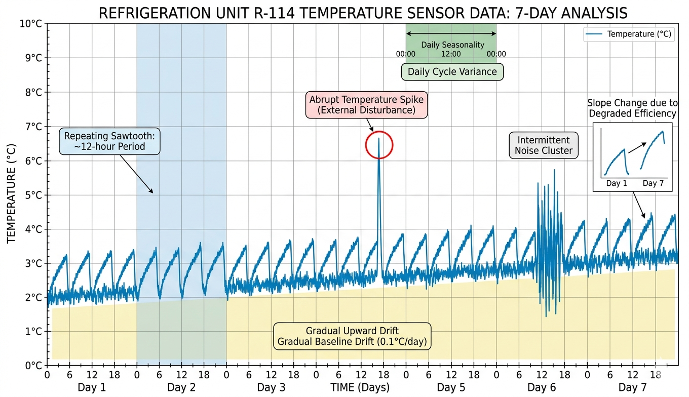
Consider a temperature sensor monitoring a pharmaceutical refrigerator. A line chart allows you to see the 'sawtooth' pattern of the cooling cycle. If the line begins to trend upward over several days, it indicates a slow refrigerant leak or a failing seal. Conversely, a sharp, vertical spike in the line might indicate that a door was left open. When reading a line chart, look for the 'slope', the rate of change. A steep slope in a current sensor's output might indicate a sudden load increase on a motor, while a flat line suggests a steady-state operation.
- Trend Detection: Upward or downward movements over long periods.
- Seasonality: Regular patterns that repeat every hour, day, or week.
- Noise vs. Signal: Jagged lines indicate high-frequency noise, while smooth lines indicate filtered data.
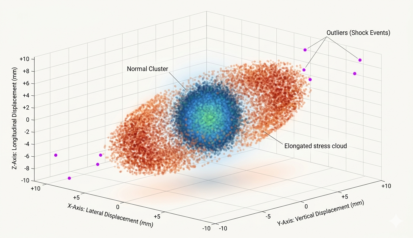
2. 3D Scatter Plots: Visualizing Multidimensional Relationships
While line charts are great for one or two variables, sensor data often involves complex interactions between three related dimensions. A 3D scatter plot places individual data points in a three-dimensional space, where each axis represents a different sensor or a different component of the same sensor.
Understanding Vibration via 3D Scatter Plots
Acceleration is a classic use case for 3D scatter plots. A typical industrial accelerometer measures vibration in three axes: X (longitudinal), Y (transverse), and Z (vertical). By plotting these three values against each other, you create a 'point cloud' that represents the movement of the machine in space.
If the machine is operating normally, the points will likely form a tight, spherical cluster near the origin (0,0,0). If the machine becomes unbalanced, the scatter plot might elongate into an elliptical shape or a 'ring,' showing that the vibration is dominant in specific directions. An outlier, a single point far away from the main cluster, represents a sudden impact or a transient shock event. Understanding this graph requires looking at the 'density' and 'shape' of the cloud rather than individual points.
In 3D scatter plots, clusters represent steady-state behavior, while the 'stretch' of the cluster indicates the direction of mechanical stress.
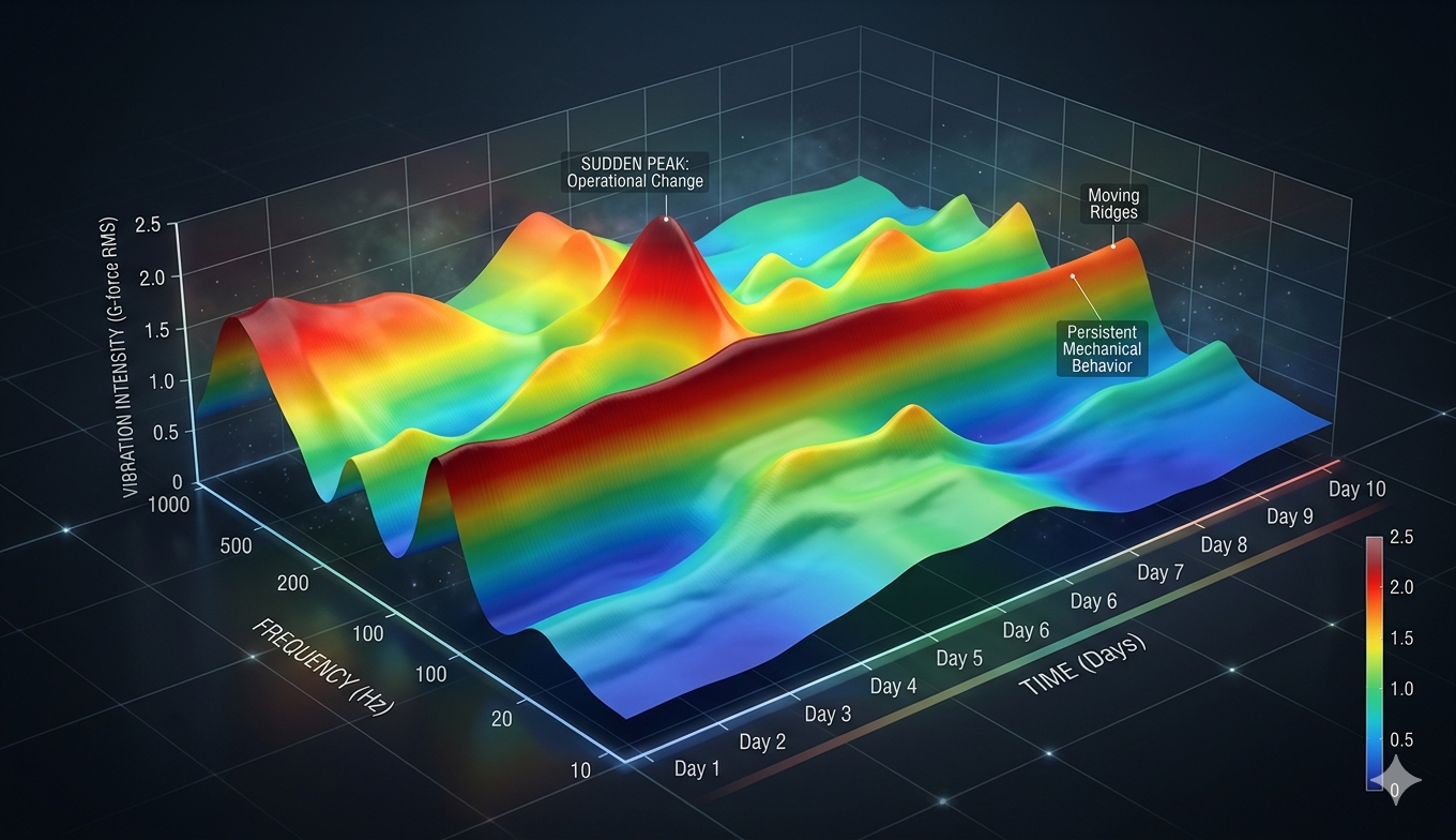
3. 3D Surface Plots: Mapping Spatiotemporal Dynamics
A 3D surface plot is essentially a topographical map of sensor data. It is used when you have two independent variables (often time and another parameter like frequency or position) and one dependent variable (the sensor intensity). It creates a continuous 'skin' over the data points, making it easy to see peaks and valleys.
Example: Thermal Distribution and Motor Health
Imagine a grid of 25 temperature sensors placed across a large server rack. A 3D surface plot can visualize the temperature (Z-axis) across the physical width (X-axis) and depth (Y-axis) of the rack. In this visualization, 'mountains' represent hot spots where airflow might be blocked, while 'valleys' represent areas of efficient cooling.
Another example is a 'Waterfall Plot' used in vibration analysis. Here, the X-axis is the frequency, the Y-axis is time, and the Z-axis (height of the surface) is the amplitude of the vibration. To understand this, look for 'ridges' that persist over time. A ridge that slowly moves toward higher frequencies indicates a bearing that is spinning faster or wearing down. A surface that is generally flat with sudden 'peaks' suggests intermittent interference or electrical spikes.
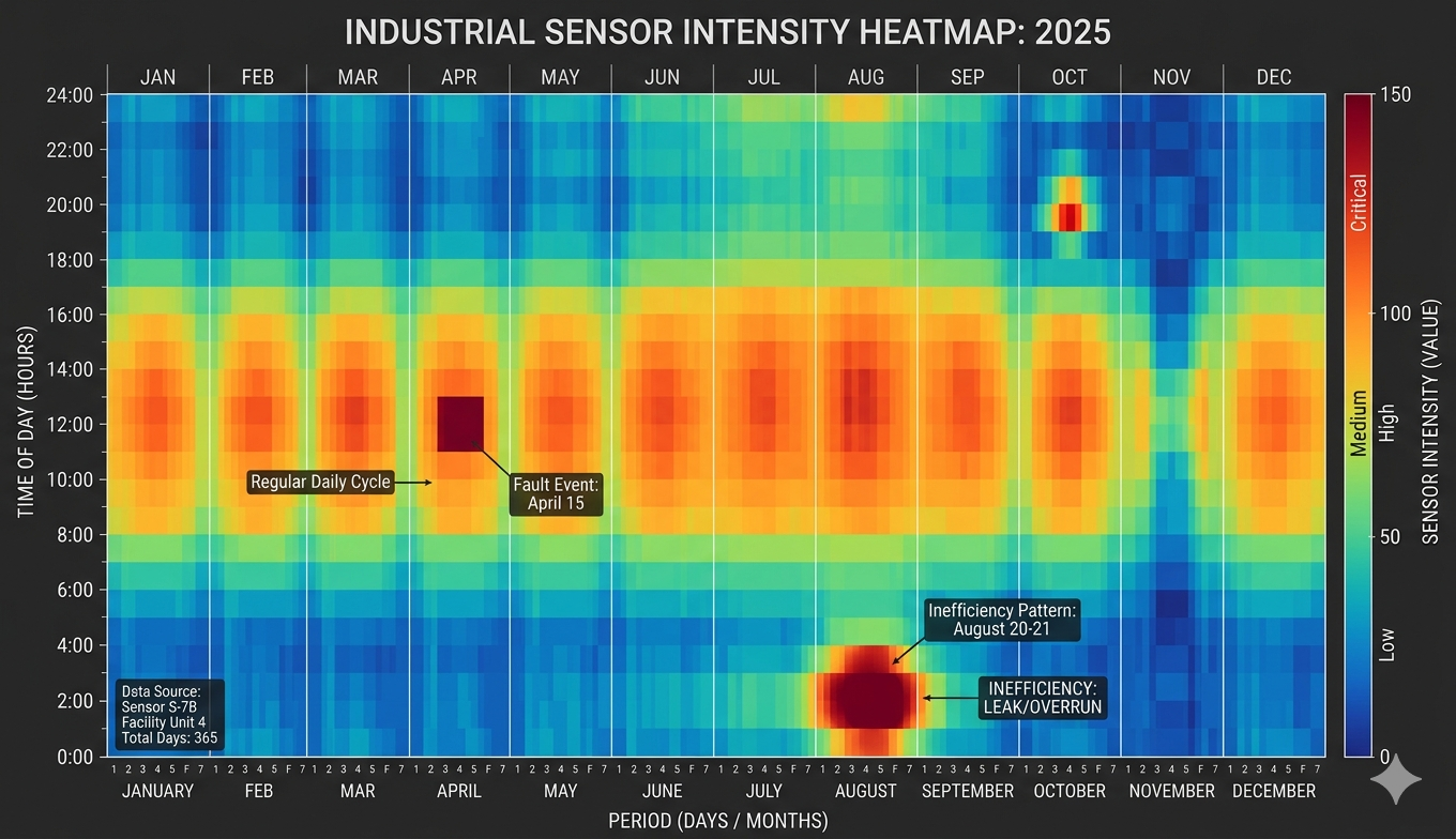
4. Heatmaps: The Power of Temporal Intensity
Heatmaps are an exceptional way to visualize 'the big picture' of sensor data over long periods. They use color to represent the magnitude of a value, typically with time of day on one axis and the date on the other.
Consider a current sensor on a factory assembly line. A heatmap can show 24 hours on the Y-axis and 365 days on the X-axis. Bright colors (red/orange) represent high current draw, while cool colors (blue/green) represent low draw. By looking at the heatmap, you can instantly see if the 'high-intensity' colors align with the scheduled shifts. If you see 'hot' blocks of color during the middle of the night when the factory should be closed, you have identified an energy waste issue or a machine that was left running unnecessarily.
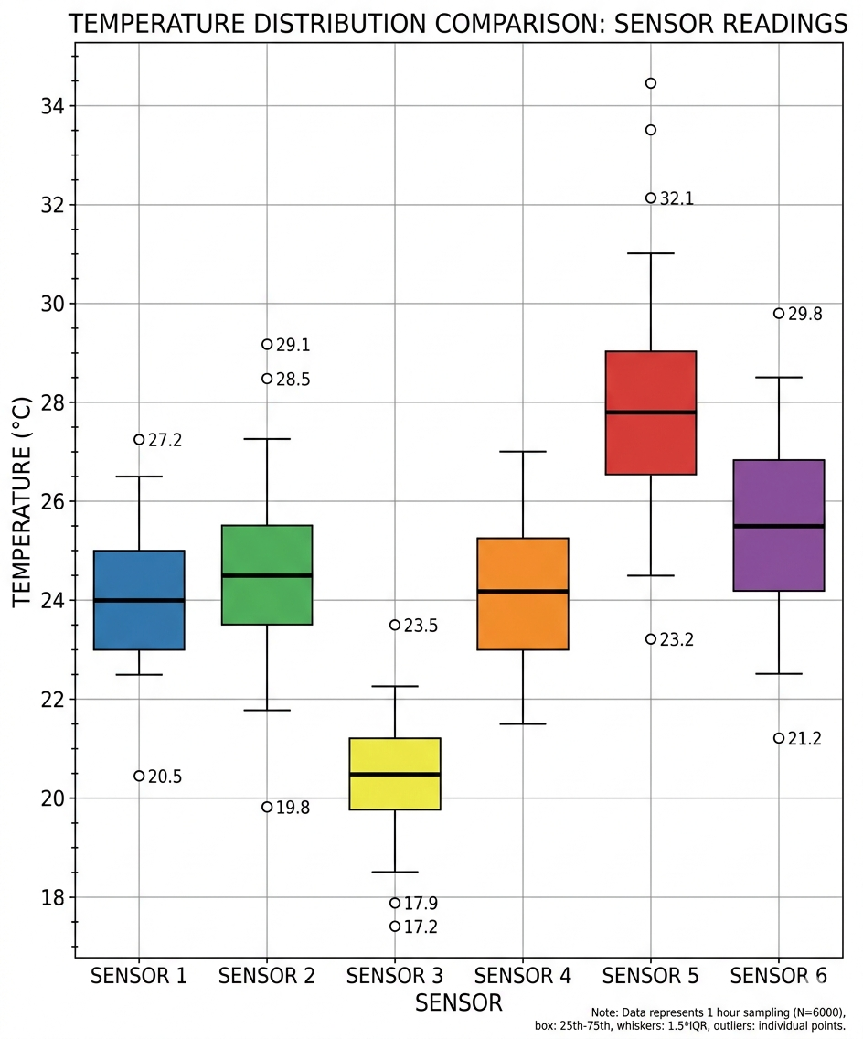
5. Histograms and Box Plots: Analyzing Statistical Distribution
While time-series charts show how data changes, histograms and box plots show how data is distributed. These are vital for sensor calibration and quality control.
- Histograms: For a current sensor, a histogram shows how often certain amperage levels occur. A 'bimodal' distribution (two peaks) might show that a machine spends most of its time either in 'Idle' or 'Full Load' with very little time in between.

- Box Plots: These are perfect for comparing multiple sensors. If you have ten temperature sensors in a room, a side-by-side box plot will show if one sensor is consistently reporting higher values than the others, indicating a need for recalibration or a localized heat source.
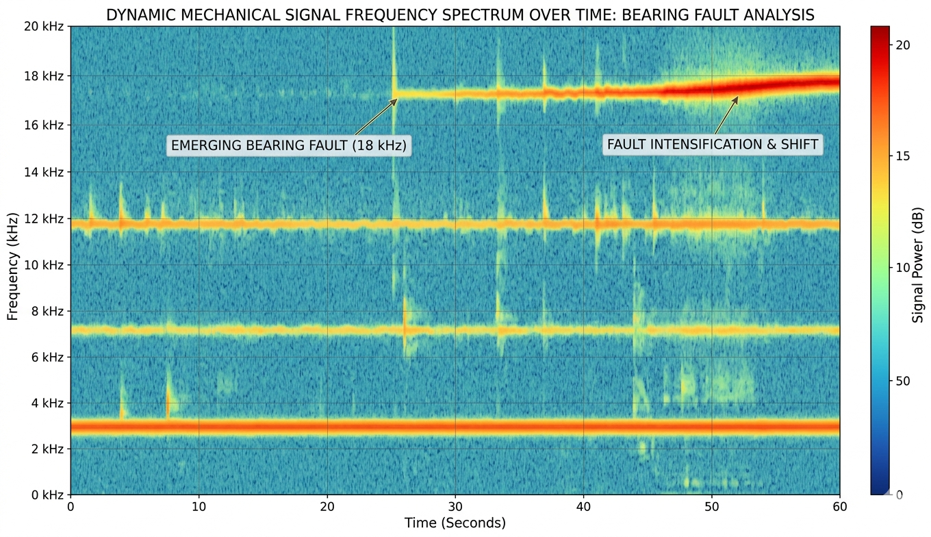
6. Spectrograms: Frequency Domain Visualization
For sensors like accelerometers or microphones, the raw time-domain data (the 'wiggly line') is often less useful than the frequency domain. A spectrogram is a visual representation of the spectrum of frequencies in a signal as they vary with time.
In a spectrogram, the X-axis is time, the Y-axis is frequency (Hz), and the color represents the power/intensity. This is the 'gold standard' for predictive maintenance. For example, a failing ball bearing produces a very specific high-frequency 'squeal' long before it can be felt by a human. On a spectrogram, this appears as a bright, horizontal line at a specific frequency. As the bearing worsens, that line might grow brighter or shift in frequency. Understanding a spectrogram is about recognizing these horizontal 'signatures' against the background noise.
Conclusion: Choosing the Right Lens
Visualizing sensor data is not about making pretty pictures; it is about choosing the right lens to see the physical reality of your system. To summarize: use line charts for trends and timing, 3D scatter plots for directional relationships in vibration, 3D surface plots for spatial distributions, and heatmaps for long-term behavioral patterns. By mastering these chart types, analysts can move from merely 'monitoring' data to truly 'understanding' the complex machines and environments they manage.
When building your dashboards, always start with the simplest visualization first. A well-configured line chart often provides 80% of the required insight. Only move to 3D plots or spectrograms when the complexity of the data, such as multi-axis vibration or frequency-dependent failure modes, demands it. Proper visualization ensures that when a sensor speaks, the human operator can hear exactly what it is trying to say.