In the modern frontend landscape, developers often face a difficult choice: build every UI component from scratch to maintain full control, or use a heavy component library that is difficult to style and bloats the bundle size. shadcn/ui offers a revolutionary middle ground. It is not a component library in the traditional sense, you do not install it as a dependency. Instead, it is a collection of re-usable components that you copy and paste into your apps.
Built on top of Radix UI for primitives and Tailwind CSS for styling, shadcn/ui provides the building blocks for a high-quality design system while giving you 100% ownership of the code. This approach allows developers to move fast without sacrificing the ability to customize every pixel of their interface.
Why Use shadcn/ui?
The primary reason developers are flocking to shadcn/ui is the balance between speed and flexibility. Traditional libraries like MUI or Ant Design come with their own styling engines and internal logic that can be hard to override. With shadcn/ui, the code lives in your 'components' folder. If you want to change how a dropdown behaves or looks, you simply edit the file directly.
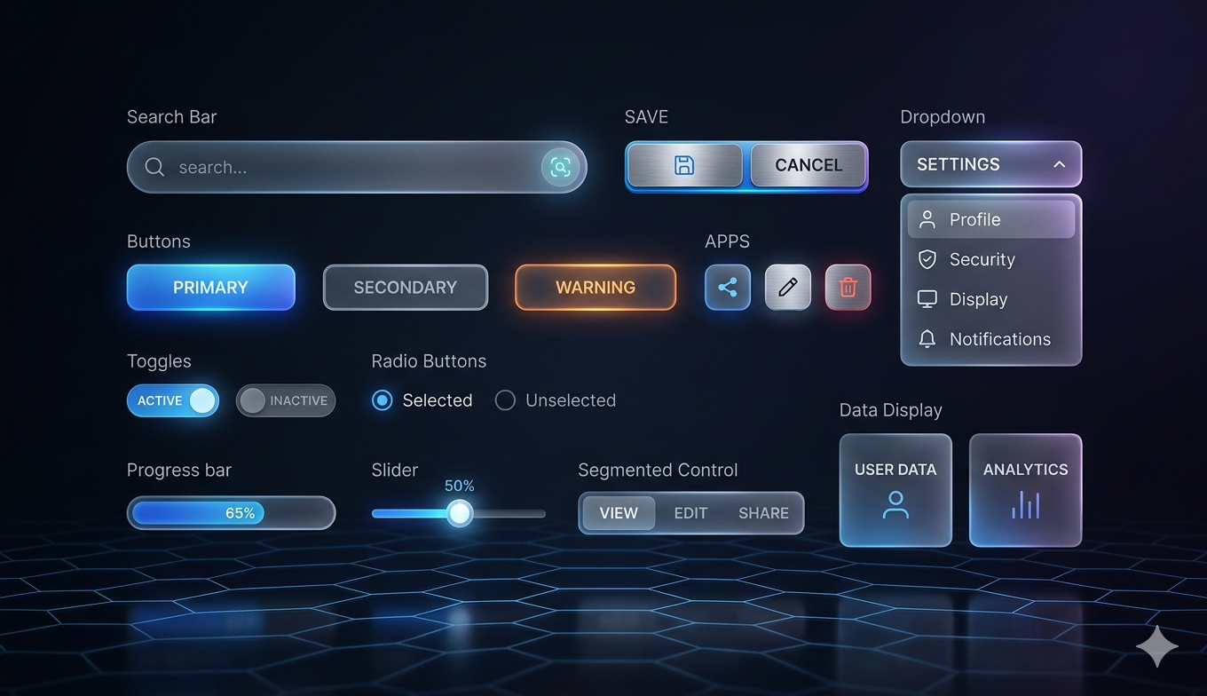
- Accessibility First: Since it uses Radix UI under the hood, components follow WAI-ARIA patterns out of the box.
- Full Ownership: You are not locked into a versioned package; the code is yours to modify and maintain.
- Beautiful Defaults: The default aesthetics are clean, professional, and follow modern design trends.
- Type Safety: Written in TypeScript, providing excellent developer ergonomics and autocompletion.
How It Makes Coding Easier
shadcn/ui eliminates the 'blank canvas' anxiety. Instead of spending hours configuring accessible keyboard navigation for a modal or a complex combobox, you run a single command and get a production-ready component. Because it uses Tailwind CSS, you don't have to learn a new styling syntax. You can apply the utility classes you already know to tweak the components to match your brand identity instantly.
It is essentially a bridge between the 'build everything' and 'buy everything' mentalities, offering the efficiency of a library with the freedom of custom code.
Installation and Usage Steps
Getting started is straightforward. Most developers use the CLI to initialize their project and add components as needed.
Step 1: Initialize your project
Run the following command in your terminal to set up the configuration (this works best with Next.js, Vite, or Remix projects using Tailwind CSS):
npx shadcn-ui@latest init
Step 2: Add a component
If you need a button, you don't download the whole library. You just add the button component specifically:
npx shadcn-ui@latest add button
Step 3: Import and Use
The component will be created in your local 'components/ui' folder. You can then import it into your page like any other React component:
import { Button } from '@/components/ui/button'; export default function App() { return <Button>Click Me</Button>; }
Conclusion
shadcn/ui has changed the way developers think about UI consistency and speed. By providing a set of high-quality, accessible primitives that live within your codebase, it empowers you to build professional interfaces in minutes rather than days. To explore the full list of components including charts, forms, and data tables, visit the official website.
Official Website: https://ui.shadcn.com/